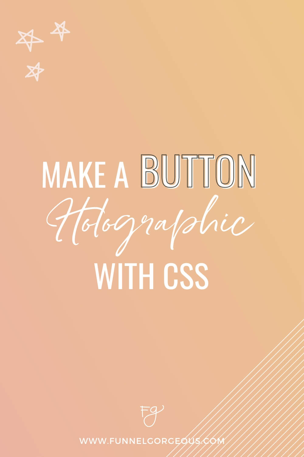
We experimented with a holographic button on our site last year, and we’ve been hooked ever since. (Seriously…????????)
That’s why—in true Funnel Gorgeous fashion—we wanted to spread the love! (Or in this case, the tutorial and code for the button of our dreams.)
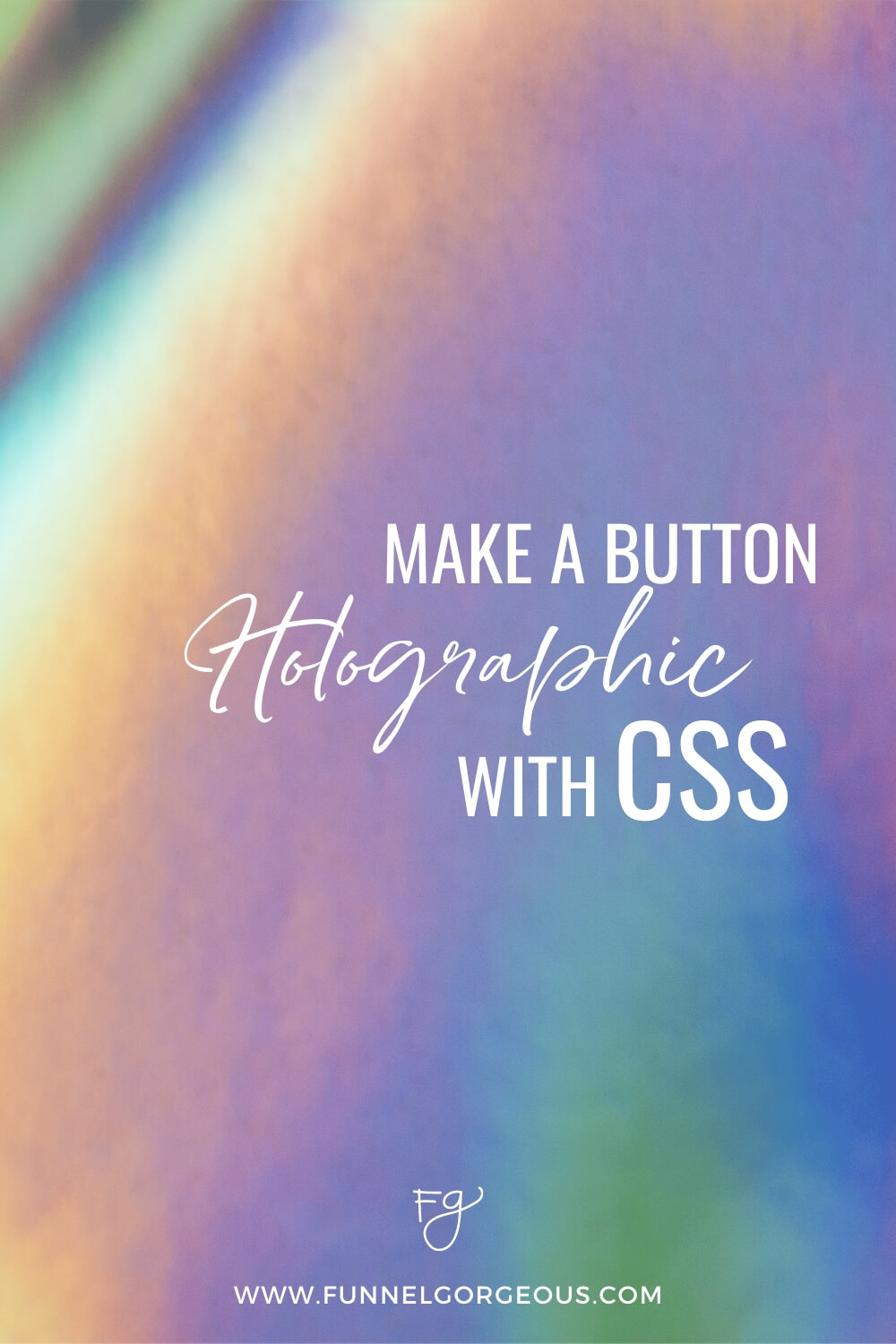
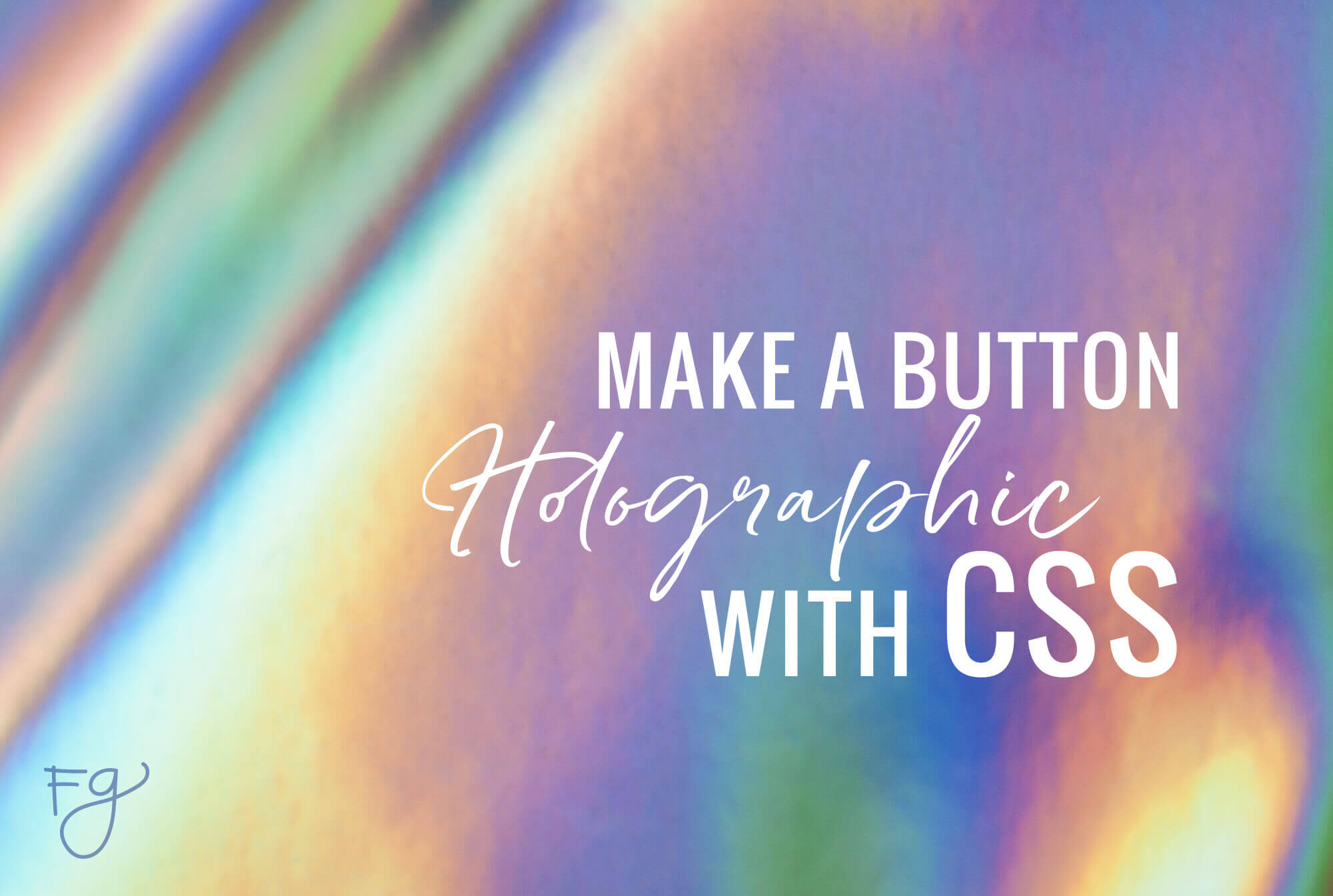
Cathy explains how to make a holographic button with CSS, then goes into detail about button customization. Follow along to learn how to make the button itself, then set the background image, speed, and movement.
/* START GRADIENT BUTTON */
#YOUR-BUTTON-ID-HERE {
background-image: url('YOUR-IMAGE-URL-HERE');
background-size: 600% 600%;
animation: gradientBG 5s ease infinite;
}
@keyframes gradientBG {
0% { background-position: 0% 50%; }
50% { background-position: 100% 50%; }
100% { background-position: 0% 50%; }
}
/* END GRADIENT BUTTON */
We made this button within ClickFunnels, but you can build this out in any page editor!
If you’re loving this post, we’d love to hear about it! Share in our Facebook group or tag us on Instagram…and show us how you used your new holographic button!
